ADVANCED TYPOGRAPHY PROJECT 2

7 October 2019 - 21 October 2019 ( week 7 - week 9 )
Ahmed Baahy Suhail (0333925)
Advanced Typography
Project 2
LECTURES
Lecture 08: No Lecture
14 October 2019 (week 08)
Lecture 09: No Lecture
21 October 2019 (week 09)
INSTRUCTIONS
PROJECT 2 - Collateral
Project 2 was to incorporate the key artwork we created into collateral in the form of a poster, tote bag, Tshirt as well as a microsite which we are meant to advertise the design colloquium. I first proceeded to create the poster.
 |
| Fig 1.1: Poster process |
 |
| Fig 1.2: Draft 1 |
The feedback for this was not great as placing the content inevitably ruined the artwork. Hence, I put the content outside the artwork instead.
 |
| Fig 1.3: Draft 2 |
Mr Vinod said the text size was too big and when I went to check, the size was about 32 pts. He also suggested to have the content on a single line instead of two as seen above. I reduced the text size to 18 pt as my teacher said to keep it within 14 pts to 16 18 pts max.
 |
| Fig 1.4: Draft 3 |
 |
| Fig 1.5: Aligning names |
 |
| Fig 1.6: Poster final |
PDF of Final Poster
After the poster was finalized, I went on to create multiple drafts of totebag and Tshirt designs. Here are the designs I came up with.
 |
| Fig 1.7: Tote Bag- Draft 1 |
 |
| Fig 1.8: Tote Bag- Draft 2 |
 |
| Fig 1.9: Tote Bag- Draft 3 |
 |
| Fig 2.0: Tote Bag- Draft 4 |
 |
| Fig 2.0: Tote Bag- Draft 5 |
 |
| Fig 2.1: Tshirt- Draft 1 |
 |
| Fig 2.2: Tshirt- Draft 2 |
 |
| Fig 2.3: Tshirt- Draft 3 |
 |
| Fig 2.4: Tshirt- Draft 4 |
 |
| Fig 2.5: Tshirt- Draft 5 |
 |
| Fig 2.6: Tshirt- Draft 6 |
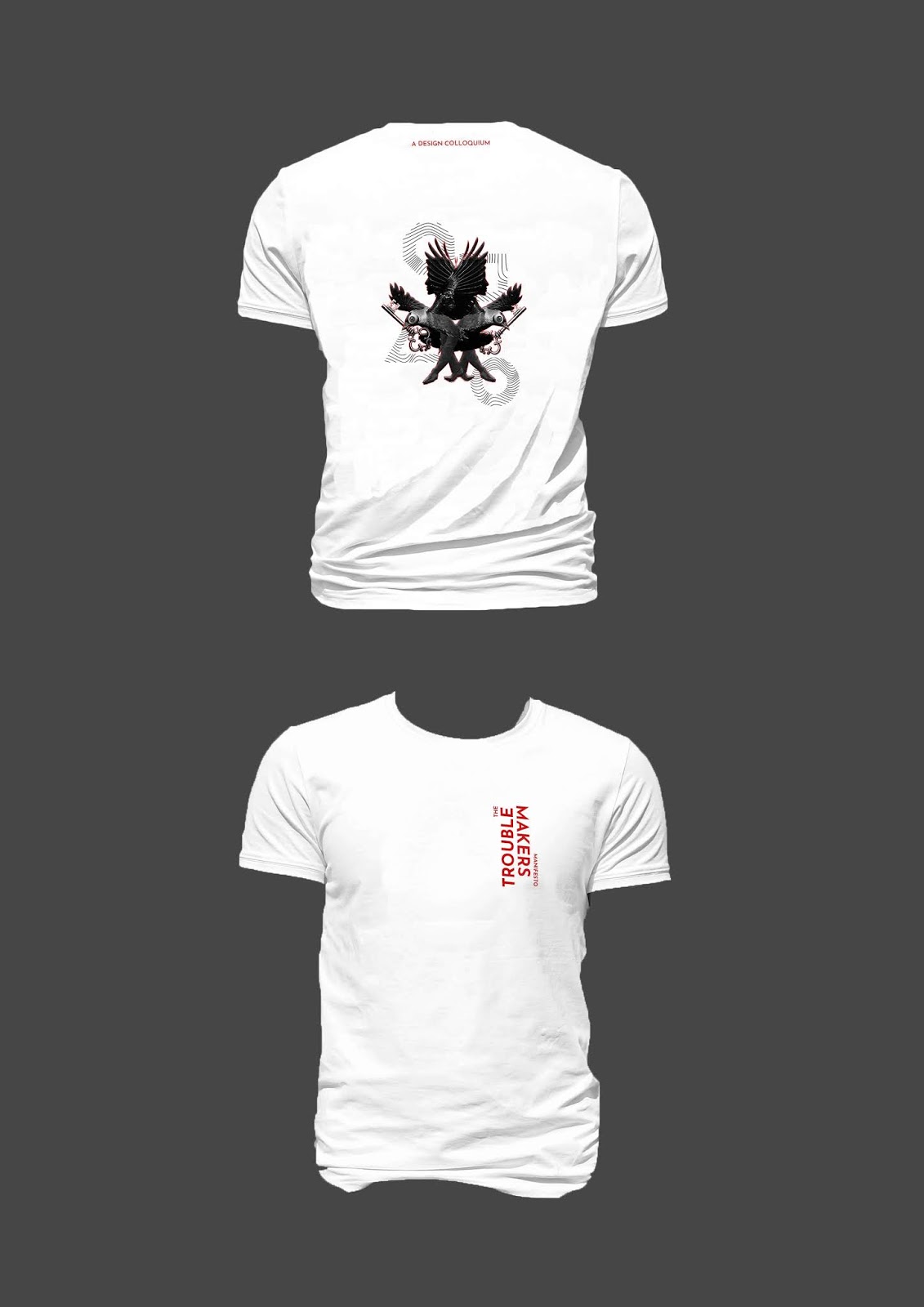
The following are the confirmed collateral for this project.
 |
| Fig 2.7: Tote Bag front- Final |
 |
| Fig 2.8: Tote Bag back- Final |
 |
| Fig 2.9: Tshirt- Final |
 |
| Fig 3.0: Flat Lay |
Here is the link for the microsite:
 |
| Fig 3.1: Screenshot of micosite |
https://ahmedbaahysuhailproject2.000webhostapp.com/index1.html
FEEDBACK
Week 08: Specific Feedback:
For my poster, Mr Vinod said I ruined my artwork by placing the text contents on my key artwork and to refrain from doing that and to rather place the content around the artwork as there is a lot of space. Thus, I made the changes necessary and showed my teacher again. He said to check the text size as it seemed too big which it was and to make the names and times on a single line and I proceeded to make the changes. Finally I got the poster approved at the end of the class. My teacher asked me about the rest of my collateral and I showed my draft which was very rough and Mr Vinod told me to make it more realistic since my text was going out of the clothes so I told him it is still a very rough draft right now.
General Feedback:
First need to understand what an idea is. My teacher said it seems like a lot of us still do not understand how to generate an idea and that we are still incapable of coming up with a solid idea relevant to the project at hand. He then proceeded to show us the different type of ideas that exist and compared advertising ideas to graphic design ones and broke down the difference. This was to show that all ideas are different. but relevant to their subject in their own way. Mr Vinod also urged us to critique our own work rather than depending on their feedback all the time. We as students must understand and be able to differentiate what a good design is and is not, especially after having some experience up until now.
Week 09: Specific Feedback:
I had to make some adjustments to my poster as it was not aligned properly so after fixing that and getting it printed, I showed Mr Vinod and he approved it. As for my totebags, he said to stick with the one I liked but for my Tshirts, I did not make use of the shapes that much so he said to put more emphasis on that aspect and he wished that I was more explorative. At home, I worked on the Tshirts and sent it to Mr Vinod online and he said that I can finally move on to thinking about the final project.
General Feedback:
Be careful when breaking apart the key artwork as the message of the design colloquium must still be evident despite removing elements. Don't remove too much, be meticulous. Print out your poster in A3 black and white to see how it looks as it is risky to just print the final thing.
REFLECTION
EXPERIENCE:
Week 08: Today went pretty smoothly as I managed to get my poster approved by the end of the class. It was not as tiring of a day as I thought it would be and I was satisfied that I managed to get the work done which is not something I manage to do as often as I like.
Week 09: I was satisfied that my poster and totebag were approved however was hoping that mt Tshirts would be too as I liked my designs. But, after hearing feedback I did see roo for improvement. Overall it was a good day.
OBSERVATIONS:
Week 08: I noticed that a lot of the key artwork and designs contained the color red and hence it was interesting to see that red is associated by a lot of people as the symbol for braveness and perseverance.
Week 09: I saw that a lot of the printed versions of the posters were missing elements and it happened to mine as well so was wondering what caused this. It was fixed by saving as a jpeg and saving that file again as pdf.
FINDINGS:
Week 08: I found that an idea in itself can branch out into different categories and that it is crucial to first be able to differentiate ideas into these branches before beginning to come up with one relevant to the project at hand.
Week 09: I found the importance in emphasizing the key elements of my design whilst rearranging for the collateral. It was a learning experience and I started to think more meticulously in order to still keep the message intact.
FURTHER READING
No More Rules: Graphic Design And Postmodernism: Rick Poyner
Week 8-9
 |
| Fig 3.2: No More Rules |
This book communicates the thoughts and ideologies of postmodern graphic designers and how they incorporate postmodern elements into graphic design. It portrays how this style has moulded graphic design and it's impact during the 1980's and 1990's which is an era that drastically changed the course of design discipline. This book conveys the tie period where designers detached from the rule book and began experimenting through their new profound visions. There are many key themes in this book all clearly shown through the inspiring examples provided. The themes consist of American new wave, punk and it;s aftermath, deconstructionist theory and design, the digital type revolution, typography grunge, graphic authorship and graphic agitation, retro and the vernacular and the new approaches to design. Since we are creating posters, there are examples provided of graphic design posters which are appealing and a lot of inspiring designs were present.


Comments
Post a Comment