ADVANCED TYPOGRAPHY EXERCISES

26 August 2019 - 23 September 2019 ( week 1 - week 5 )
Ahmed Baahy Suhail (0333925)
Ahmed Baahy Suhail (0333925)
Advanced Typography
Exercises
LECTURES
Lecture 01: Typographic Systems
26 August 2019 (week 01)
During the first class of Advanced Typography, Mr Vinod surprised the whole class by saying that this semester, the students will be giving the lecture as it will help us process the information better. Mr Vinod told us that even though the workload is less this semester, we still need to be alert of the conceptual aspect of design and to use all the skills we have learnt last semester and apply it this time around. Going back to the presentation, we were split up into 4 groups and I was in group 3. We were given the typographic systems modular and grid to talk about and had about an hour or so to prepare slides and get ready for the lecture.
Here is my group's presentation. I covered the rectangle thumbnail variation for modular systems.
Lecture 02: No lecture
2 September 2019 (week 02)
There was no lecture this week as it was a public holiday. Class was only 3 hours long so only had time for feedback and briefing for the next task of the exercise.
Lecture 03: No lecture
9 September 2019 (week 03)
Today was also more or less the same as last week. We just patiently waited for feedback for the finding type exercise and later was briefed on the last exercise for this semester before we move on to projects.
Lecture 04: No lecture
16 September 2019 (week 04)
There was no class today due to public holidays.
Lecture 05: Typographic Perception & Organization
23 September 2019 (week 05)
My group had to present today on typographic presentation & organization. It's a good thing that my presentation was early on so I don't have to worry about it later on in the semester. Our group consisted of 9 people so we split the topics evenly. I presented with Eunice on Gestalt Laws and my section was on the Law of Pragnanz, Continuity and Common Region. After the presentation, we were given more feedback on our exercise and then was briefed on project 1.
This is our presentation.
INSTRUCTIONS
EXERCISES
Exercise 1- Typographic Systems
Exercise 1 was to use all 8 of the typographic systems used and create 2 layouts each in InDesign.
 |
| Fig 1.1: Random |
 |
| Fig 1.2: Transitional |
 |
| Fig 1.3: Axial |
 |
| Fig 1.4: Modular |
 |
| Fig 1.5: Grid |
 |
| Fig 1.6: Dilational |
 |
| Fig 1.7: Radial |
 |
| Fig 1.8: Bilateral |
Typographic Sytem Layouts (After Feedback)
 |
| Fig 1.9: Random (revised) |
 |
| Fig 2.0: Transitional (revised) |
 |
| Fig 2.1: Axial (revised) |
 |
| Fig 2.2: Modular (revised) |
 |
| Fig 2.3: Dilational (revised) |
 |
| Fig 2.4: Grid (revised) |
 |
| Fig 2.5: Radial (revised) |
 |
| Fig 2.6: Bilateral (revised) |
Exercise 1 Final PDF
Exercise 2- Finding Type
Exercise 2 consisted of picking any man made object or natural element, tracing it and the dissecting it to find letter forms within it. The minimum was 5 but we were encouraged to find as much as possible.
 |
| Fig 3.1 Picture of plant for "Finding Type" |
 |
| Fig 3.2: Tracing out image |
 |
| Fig 3.3: Image traced |
 |
| Fig 3.4: Letter R |
 |
| Fig 3.5: Letter X |
 |
| Fig 3.6: Letter F |
 |
| Fig 3.7: Letter Y |
 |
| Fig 3.8: Letter L |
 |
| Fig 3.9: Letter B |
 |
| Fig 4.0: Letter A |
 |
| Fig 4.1 Letter E |
 |
| Fig 4.2: Letter H |
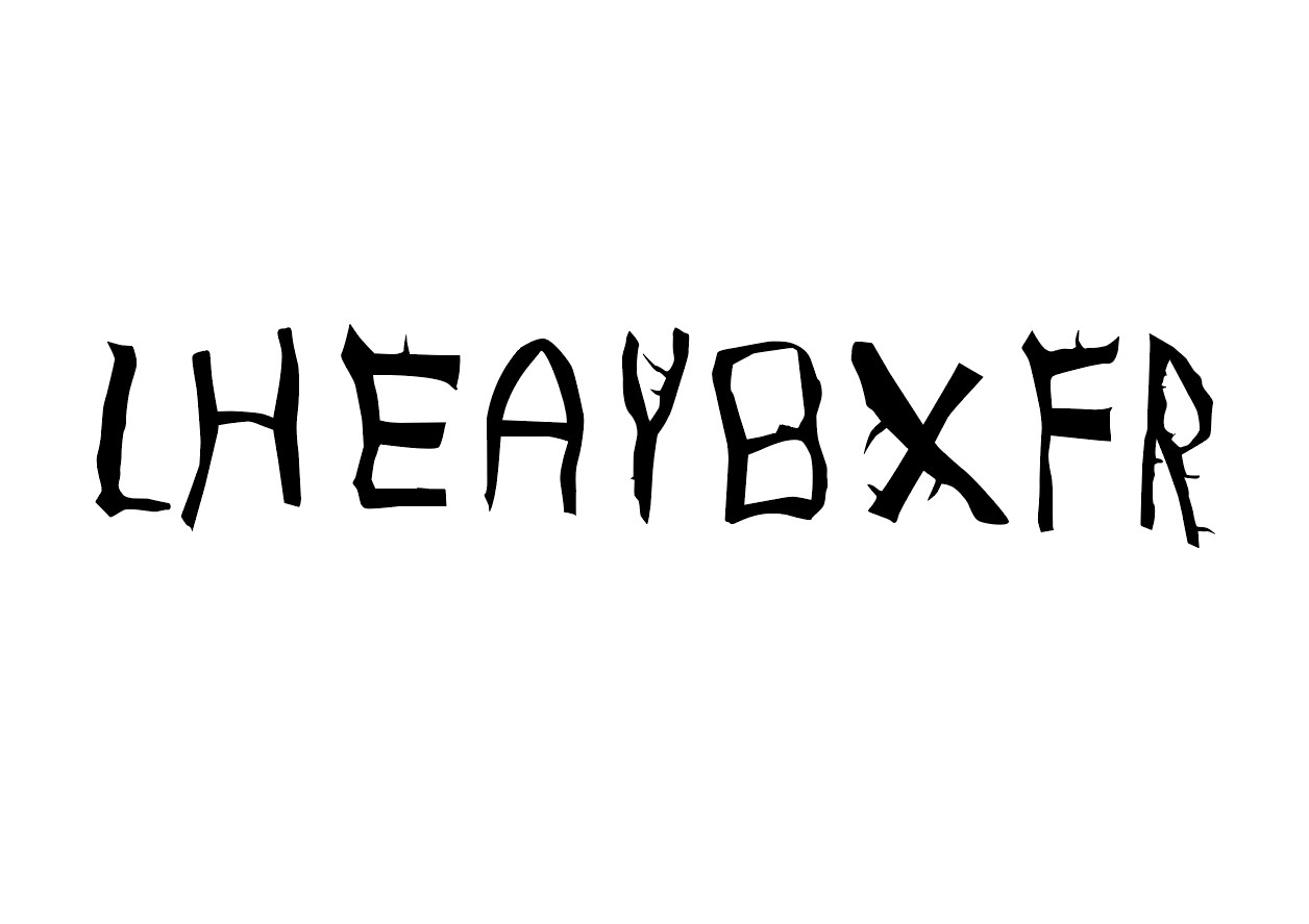 |
| Fig 4.3: All letter forms on a baseline |
 |
| Fig 4.4: Starting to refine |
 |
| Fig 4.5: Process of refining |
 |
| Fig 4.6: Refining stage 1 |
 |
| Fig 4.7: Refining stage 2 |
 |
| Fig: 4.8: Refining stage 3 |
 |
| Fig 4.9: Final refined version of 'Finding Type" |
Exercise 2 Final PDF
Exercise 3- Type & Play
Our next task was to intertwine text and image together in a harmony which makes sense and communicates the context of an image clearly through the unison of type and image. We were challenged to create a composition that speaks visually and is cohesive.
 |
| Fig 5.1: Own image selected for exercise |
 |
| Fig 5.2: Working in Photoshop |
 |
| Fig 5.3: Figuring out phrase |
 |
| Fig 5.4: Experimenting with composition |
 |
| Fig 5.5: Experimenting with composition |
 |
| Fig 5.6: First draft |
 |
| Fig 5.7: Trying out second draft |
 |
| Fig 5.8: Overlapping text with image |
 |
| Fig 5.9: Adding color |
 |
| Fig 6.0: Second draft |
Second draft turned out horrible and I was not satisfied at all so I had to restart again. This time, I searched for images under one particular theme and I decided on "suffocation." This was the image I chose. For my typographical message, I thought of "Suffocating Suffocation."
 |
| Fig 6.1: Image used for final draft |
 |
| Fig 6.2: Process |
 |
| Fig 6.3: Warping text around image |
 |
| Fig 6.4: Duplication of text |
 |
| Fig 6.5: Adding new text |
 |
| Fig 6.6: Reducing opacity to 50% |
 |
| Fig 6.7: Improving placement |
 |
| Fig 6.8: Final touches |
 |
| Fig 6.9: Final "Type & Play" "Suffocating Suffocation" |
Exercise 3 Final PDF
FEEDBACK
Week 01: No feedback
Week 02: Specific feedback: Mr Vinod said that my random system was not random enough. He liked my radial and dilational systems. My bilateral system was correct however he said it is too simple and not interesting. I was also told to make some of my text. Baahy, your eportfolio is non existent. Please ensure it is up to date.
General feedback: Make a 0.5 point size box around our designs to put on our blog. Also we were
urged to decrease our point size to anywhere between 8-11.
Week 03: Specific Feedback: Mr Vinod and Mr Shamsul liked the progress I had so far. I had 9 letterforms so they said to cut it down to 5. They said to maintain the characteristic and used my X as a starting point to represent how the other letter forms can be. They said to keep refining a bit more and that I am on the right track.
Week 04: No online feedback.
Week 05: Specific feedback: When i texted Mr Vinod for feedback for my first idea he said, "Not really working. Your image and your text. The overall composition is weighted to one side." Mr Vinod said my second idea is horrible so I have to restart. I did not use the space well.
For my last draft, he replied saying, "It’s interesting... only the text seems very minimal in contrast with the image... it’s a very sensitive execution though, but isn’t typographically heavy ... tends to be weighted toward the image.
REFLECTION
EXPERIENCE:
Week 01: I was not prepared to give a presentation in front of the whole class as I am not comfortable with public speaking so the nerves got to me a little during this class. I was nervous that I would forget my part and embarrass myself but I think the presentation went smoothly, and I felt relieved as soon as my part was over. I was not surprised when Mr Vinod asked me a question during the Q&A of another group's presentation as I am starting to get used to it and last semester I used to get very uncomfortable when he called me out but this semester I feel that I can handle the pressure better.
Week 02: Today was probably the most relaxed typography class since it was a public holiday. The class felt really empty and my teachers were dressed very casual, with shorts and all. Had to be patient to get our feedback so everyone seemed pretty bored.
Week 03: We had another 3 hour class in which we got our feedback for exercise 2 and then later was given the next task.
Week 04: No class
Week 05: I was satisfied with my part of the presentation and feel a bit nervous for next week's lecture as there is a possibility to be called out to answer a question so have to pay attention. What I was not satisfied with was my draft for "Type & Play". I did not use my full potential and I felt the disappointment of Mr Vinod so I have to really make my next design impactful.
OBSERVATIONS:
Week 01: I observed that I am capable of speaking in front of my class without being completely prepared.
Week 02: I noticed that I made a typo on my typographic system layouts. Instead of writing "on", I wrote "of" so had to fix that error for all 16 designs.
Week 03: Finding Type exercise is a bit challenging in terms of maintaining the consistency but overall I am really enjoying this exercise.
Week 04: I wasted a lot of time trying to find the "right' picture for my Type & Play exercise.
Week 05: My composition skills need to really improve and I have to understand how to make use of a space
FINDINGS:
Week 01: Be calm during unexpected times such as when I was asked a question and during my part of the presentation
Week 02: Aligning is especially important when it comes to grid and modular system
Week 03: I found that sticking to one exercise is more efficient rather than switching back and forth.
Week 04: It is better to focus on one theme of image rather than trying to search for different things. Stick to one theme and explore through the related pictures of that such theme.
Week 05: I found that I can achieve the goal of the "type and play" exercise better if I take a simpler approach.
FURTHER READING
New Modernist Type: Steven Heller, Gail Anderson: Thames & Hudson
Week 1-3
This book has visual references to lots of modern type designs from artists all around the globe. I got a lot of inspiration and ideas on incorporating type with image. I took some pictures so I can refer back to the layouts if I lack inspiration later on.
The Field Guide To Typography: Typefaces In The Urban Landscape: Thames & Hudson: Peter Dawson
 |
| Fig 7.1: New Modernist Type |
This book has visual references to lots of modern type designs from artists all around the globe. I got a lot of inspiration and ideas on incorporating type with image. I took some pictures so I can refer back to the layouts if I lack inspiration later on.
The Field Guide To Typography: Typefaces In The Urban Landscape: Thames & Hudson: Peter Dawson
Week 3-4
I chose this book as I struggled to make use of the negative space of my design for my "Type & Play" exercise. This book stated the importance of researching before starting a design and since we are being more conceptual, the chapter on researching was pretty releavnt. I did not have much time to read the whole book so I flipped through the chapters that seemed to relate to project 1.
Chapter 3 was titled " i need to design this today " and as I was running out of time, I could not have asked for a better book to read. This introduces the "works every time layout" and suppposedly it does work every time. It talks about how as readers, our eyes move from top left to bottom right so direction and order is super important to executing a good layout. There are seven parts of this which are, margins, columns, visuals, cutline , headline, copy and tag. Basically, margins and columns serve as the foundation and visuals are placed at the top of the layout since people are drawn to pictures first. Next, a cutline, also known as caption and the headline is placed at the bottom of the picture. This is mainly for brochures but can be applied to anything. A key point I took away is that great design revolves around creating a composition that controls the eye's flow.
Chapter 7 was on layout so I read through that to get some tips on how to make a good poster design for project 1. Often times I struggle with finding the right place to put my content and visuals. First things first is to create a focal point. You can use the golden proportion and rule of thirds to decide the best place to put your visuals. This chapter also mentions about where to put negative space and to avoid trapped space.
 |
| Fig 7.2: The Field Guide To Typography |
This book flaunts a compilation of over 125 typefaces ranging from old fonts to recent ones and consists of some rather unusual typefaces to contrast with the common ones. Since we have only been using 9 typefaces, I discovered a lot new typefaces that I have never heard of before. I had no idea there were such a vast amount of unique typefaces out there and I was drawn by the photographic references which made me want to flip through each and every page. I have a greater appreciation for Typography after reading this.
White Space Is Not Your Enemy: A Beginner's Guide To Communicating Visually Through Graphic, Web & Multimedia Design: Kim Golombisky & Rebecca Hagen
Week 5
 |
| Fig 7.3: White Space Is Not Enemy |
I chose this book as I struggled to make use of the negative space of my design for my "Type & Play" exercise. This book stated the importance of researching before starting a design and since we are being more conceptual, the chapter on researching was pretty releavnt. I did not have much time to read the whole book so I flipped through the chapters that seemed to relate to project 1.
Chapter 3 was titled " i need to design this today " and as I was running out of time, I could not have asked for a better book to read. This introduces the "works every time layout" and suppposedly it does work every time. It talks about how as readers, our eyes move from top left to bottom right so direction and order is super important to executing a good layout. There are seven parts of this which are, margins, columns, visuals, cutline , headline, copy and tag. Basically, margins and columns serve as the foundation and visuals are placed at the top of the layout since people are drawn to pictures first. Next, a cutline, also known as caption and the headline is placed at the bottom of the picture. This is mainly for brochures but can be applied to anything. A key point I took away is that great design revolves around creating a composition that controls the eye's flow.
Chapter 7 was on layout so I read through that to get some tips on how to make a good poster design for project 1. Often times I struggle with finding the right place to put my content and visuals. First things first is to create a focal point. You can use the golden proportion and rule of thirds to decide the best place to put your visuals. This chapter also mentions about where to put negative space and to avoid trapped space.


Comments
Post a Comment