TYPOGRAPHY PROJECT 1

3 May 2019 - 17 May 2019 (week 05-week07)
Ahmed Baahy Suhail (0333925)
Typography
Project 1- Text Formatting and Expression
LECTURE NOTES
Lecture 05: Understanding Letter forms
3 May 2019 ( week 05 )
In this class, Mr Vinod narrowed and broke type down very closely and highlighted the many minimal yet, important details that we might have overlooked. It is the small details that differentiates one type face from the other and gives them their own attributes and characteristics. Sir also noted that even though lots of letter forms may seem symmetrical, in actuality, when deconstructed, they are not. Their stroke weights change and vary from each/ either side. Similarly, the X height of all letters may seem to be even however they are not. This is due to the fact that rounded letters either have to rise above the median or they must sink below the baseline thus in reality, the x height is never the same.
Lecture 06: Cancelled
10 May 2019 ( week 06 )
We did not have a lecture today as we were asked to format and fix our blogs immediately and were instructed to follow Jennifer's design blog specifically.
10 May 2019 ( week 06 )
We did not have a lecture today as we were asked to format and fix our blogs immediately and were instructed to follow Jennifer's design blog specifically.
Lecture 07: Typography
17 May 2019 ( week 07 )
When I walked into class, Mr Vinod was already talking to the students present and giving a mini lecture. This was regarding how to construct a layout. He taught us what makes a good composition through an exercise where we were told to black out the text of our spreads and walk around the class and pick what caught our attention. He asked us why we liked/ disliked our peers work and through this, he taught us that for a layout to be attractive, it needs to be balanced and clean. Mr Vinod also taught us the importance of alignment as well as how the use of space can affect composition. After this, we had the continuation lecture for tracking and kerning. Tracking refers to the uniform adjustment of letter spacing whereas kerning adjusts the spacing of individual letters.
INSTRUCTIONS
PROJECT 1 / Text Formatting and Expression
Our first project was to create a design layout based on an article called,, using the 9 typefaces provided to us. We had to fulfill two tasks. First one was to express the headline so that it represents the meaning behind the article. Last task is to format the article appropriately. This project is to be done in InDesign.
 |
| Fig 1.1: Sketches |
 |
| Fig 1.2: Sketches |
After doing the sketches, I proceeded working on Indesign as I had a vague idea on what I wanted to do.
 |
| Fig 1.3: Working on first draft |
 |
| Fig 1.4: First draft |
 |
| Fig 1.5: Second draft |
 |
| Fig 1.6: Third draft |
All my drafts were unacceptable thus I had one more week to work on new expressions for the headline and to format the article. Mr Vinod suggested making the subheading of the third draft follow the circle therefore I first thought about making the phrase spiral out from the circle.
 |
| Fig 1.7: Spiraling out |
As you can see, this turned out a bit awkward due to the odd gap and so I made the text align better with the edge of the circle.
 |
| Fig 1.8: Improved third draft design |
I also had to improve the first draft's design as Mr Vinod said it is not as meaningless as the others but I can work on the arrangement and layout. He also told me to change the font to sans serif.
 |
| Fig 1.9: Improved first draft design |
Since my second draft was rejected completely, I decided to make some expressions of Illustrator and then choose from there.
 |
| Fig 2.0: All design expressions on Illustrator |
For my third design, I had an idea in mind however I did not know what colors would work well and how to arrange it in the 200 mm by 200 mm box. I made most of my designs black as I wanted it to stand out and have an impact.
 |
| Fig 2.1: Third design draft 1 |
 |
| Fig 2.2: Third design draft 2 |
 |
| Fig 2.3: Third design draft 3 |
 |
| Fig 3.3: Third design draft 4 |
 |
| Fig 3.4: Third design draft 4 ( improved) |
 |
| Fig 3.5: Working on spread after feedback |
 |
| Fig 3.6: Alignment of final design |
 |
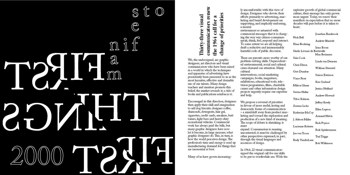
| Fig 3.8: Project 1 final design |
 |
| Fig: 3.9: Final headline design |
My main intention in this design was to focus on shift, as the whole article revolves around a stern stance to change & reverse the priorities of design and direct it towards a more efficient communication method, "a mind shift away from product marketing and towards the production and exploration of a new kind of medium". Generally, a design is particularly divided in the idea and on the skill and imagination thus I thought of ways to divide the phrase "first things first" in to two and split it. "Consumerism is running uncontested; it must be challenged by other perspectives expressed, in part, through the visual languages and resources of design". Consumerism must be challenged by the effective use of visual language and this split is my attempt at showing the clash between these two. Through this split, I want the viewer to envision consumers and designers and how they affect each other. This line also, in hindsight is showing consumers in two halves, people who buy things just for the sake of it and people who are mindful about what they consume. Similarly, designers are split into two sections, those who only design for aesthetics and are driven by greed, while the other half who work to give back. They both exist at the same time and the ones who only want to earn gets to rise higher due to the way consumerism works and they get to sell and advertise their work more than the ones who are trying to give back to society and make an impact. I wanted to remind the viewer that something else is there to bring change to the scales and to challenge consumerism. The first things first is reflected to show reversal, as in the article, a call for a reversal of priorities is particularly stressed upon. "Manifesto"is arranged in the shape of a staircase to portray the progression and change and that this manifesto is an affirmation to step up the split between designers who work for consumerism and designers who work with their problem solving skills for the betterment of society.
Project 1 Final PDF
FEEDBACK
Week 05:
Mr Vinod came around and he told me my animation is nice and that it works. He wondered why the ice was as long as I made it so I said I wanted it to show ice shards. Lastly he just asked me about the shape of the ice so I reminded him that they are commas so he said it is fine.
Week 06:
Specific feedback: Mr Shamsul said to adjust the spacing of my blog but other than that its fine. However, Mr Vinod specifically asked whether or not I have updated it as it is atrocious. He also told me to make the gif/ pictures bigger ad to make sure all screenshots were clean and cut out nicely. Next, I showed him my three designs for project one and instantly he seemed displeased. He was shaking his head as I was trying to explain. After I was done with that he did not even want to see my other designs, I guess he already made up his mind that I did not meet the expected requirements. But then he asked if I had other ideas so I finally showed him the others. He only liked one of them and told me it needs a lot more work. He suggested researching on constructiveness and getting better ideas on composition and layout. General feedback: Keep working on project one and use this week effectively. Ideas must be approvable and clearly portrayed in the headline by next week. Make sure formatting of text is correct as that is the bare minimum.
Week 07:
Specific feedback: Mr Vinod said my split expression was good. Mr Shamsul told me to make work on my alignment for the 2nd page of my spread and increase the size of the subheading to fill the blank space. Other than that it is fine. General feedback: Put blocks around layout and observe composition. The use of space and balance is very important to make a great layout and alignment
must be there as well. Personality must be mentioned on each picture of e-portfolio.
REFLECTION
Experience
Week 05:
Today was pretty overwhelming since we got out first project. Also, we are using inDesign which is very new to me thus I felt confused yet eager to figure out this new addition to my design life. Took me a while to fully grasp the article provided and I was feeling impatient as the time went on. I spent most of the whole period attempting sketches based around the word "first" since I did not know how to incorporate the meaning into the headline.
Week 06:
The most stressful day yet for sure. I was already sleep deprived and after feedback, my emotions got the best of me and I could not control them. Hence, I had to take a little break from class just to get myself together.
Week 07: I was just working on fixing the alignment and took the feedback under consideration. Other than that, it was okay. I did not feel as stressed this time around.
Observations
Week 05: I can't keep up with writing down my notes thus I must either record or type out the information being given on my phone, that way I can go back and listen to the recording or not have to get confused looking at my quick and messy handwriting.
Week 06: I noticed that I am still not at the required standard and that I struggle to explain my idea to Mr Vinod as I am bad at phrasing out sentences in my head.
Week 07: I noticed that I can be a bit impatient at times.
Findings
Week 05: I found that I was sketching my ideas aimlessly and that I must think each moment I put pencil on paper.
Week 06: I found that I am not up the standard Mr Vinod wants me to be at. Lots of planning is required to make a design and it is not productive to work without having a clear direction in mind as I will just be wasting time.
Week 07: I found how important alignment is to a composition.
Week 06: I found that I am not up the standard Mr Vinod wants me to be at. Lots of planning is required to make a design and it is not productive to work without having a clear direction in mind as I will just be wasting time.
Week 07: I found how important alignment is to a composition.
FURTHER READING
The Complete Typographer: Second Edition: A Manual for Designing with Type: Will Hill
Week 5
The Complete Typographer: Second Edition: A Manual for Designing with Type: Will Hill
Week 5
Week 5
 |
| Fig. 4.4: The Complete Typographer |
A person who associate themselves with type must have a developed sound of knowledge regarding typography and the relationships it creates with other disciplines. We need to have historical knowledge paired with technical skills to accomplish an effective and suitable use of type and also be educated on the myriad of rules, qualities and it's aesthetics when working with different typefaces. The book begins by indulging us into the evolution of the printed word and then moves on to the terminology of type face design, fundamentals of page layout and so on. The section that I found most interesting was the final one if the book, which boasts an array of typefaces in an enticing directory. This is presented in 14 categories and organized depending on visual characteristics and historical origins. Each category showcases the evolution of type stacked with inspirational examples. This book is not only appealing but very informative.
headache.
Typex: Typography : A Teaching Experience by Hernan Ordonez
Week 6
 |
| Fig 4.5: Typex
This book is focuses completely on visual language and shows the different ways typefaces can be made and shaped. I learned about the multiple ways that any simple font can be manipulated through the many provided examples using visual aids to add more element to the typefaces. I learned how to use the space around the lettering to compliment the lettering itself. Hernan Ordonez compiled this book as a record using the work examples and developments that he created or helped create through his many classes and workshops on design and typography in Spain/
|
Lettering & Type: Creating Letters and Designing Typefaces by Bruce Willen and Nolen Strals
Week 7
 |
| Fig 4.6: Lettering & Type
This book is a simple guide on how to manipulate and create letters according to one’s will. It focuses on the context and creativity that form letters and make them more beguiling. I learned about Ellen Lupton, who is known for her love of typography. I was also introduced to many other designers, artists and illustrators through their work examples and interviews. This book taught me how important it is to have an idea before creating a typeface or even working with a vague idea to produce a font suited for the reader. I was given an introduction on the different types of lettering and the history behind each one, as well as the characteristics that lie in making all of them.
|


Comments
Post a Comment